2023 · Brainly
Try a real tutor before you ever see a price.
I replaced a scary paywall with a free trial teens could feel.
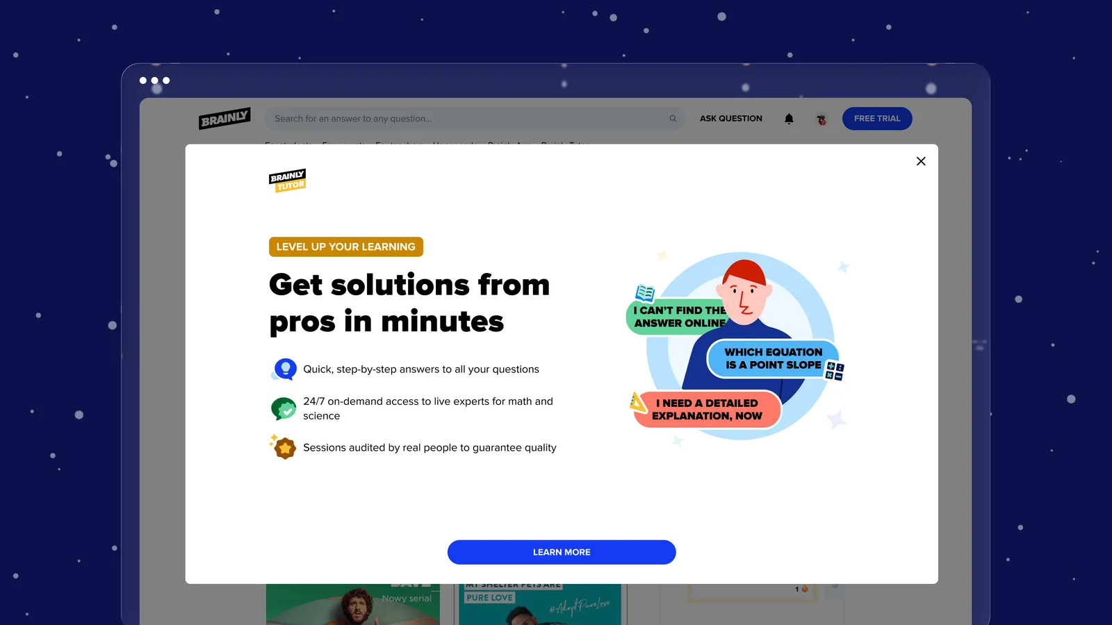
Quick overview
- Year
- 2023
- Company
- Brainly
- Role
- CX Product Designer
- Team
- Product Manager, Product Director, analysts, a UX writer, a motion designer, and engineering – coordinated in Figma and Miro
Redesigned the trial-to-paywall flow for Brainly's live tutoring product so teenagers could experience a real tutor before hitting any payment screen – instead of bouncing off a paywall they never understood.
Brainly is an education technology platform supporting 350M+ school-aged students worldwide, operating internationally with a main focus at the time on India, the US and Brazil. Projects were built team-first, with a strong design-thinking process: multidisciplinary teams of designers, product managers, engineers and analysts, and a design community that stayed close-knit across projects despite everyone working on different things.
Working at Brainly
Brainly Tutoring is Brainly’s B2C paid service – personalised, one-to-one support that lets students connect with qualified tutors in real time, 24/7, for help with maths, physics, biology and chemistry. We worked across mobile (iOS and Android) and a web-based version of the platform, inside a well-developed design system I contributed new components to as the product grew.
My role in the team
I was the core CX Designer in charge of the student-facing part of Tutoring, and later on took responsibility for the product’s monetisation too. Beyond the standard duties of a CX Designer, that included scripting, recruiting and conducting research for the US and Indian markets, designing and facilitating workshops for both my team and the wider community of designers, and working closely with analysts to design and implement statistically sound experiments. Every design decision was grounded in data – qualitative and quantitative research, with the business side always kept in view.
Designing a new user flow on web
The problem. Based on the analytics, Tutoring was struggling with a few consistent, compounding issues: people entering the flow toward buying Tutoring dropped out quickly, usually right at the paywall; those who did start a trial mostly didn’t use it, even though the data showed that more sessions during a trial meant a much better chance of conversion; and students who rated their first tutor session a 1 (the worst score) almost never came back. Together, that added up to a very low conversion rate to Tutoring subscriptions.
The old flow made all three close to inevitable. A logged-out user could only discover Tutoring through a handful of entry points, and clicking any of them dropped them straight onto a payment form – a paywall that discouraged people from trying the service rather than inviting them in.
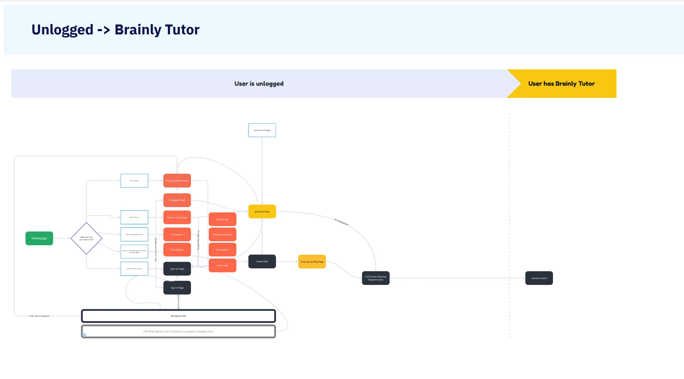
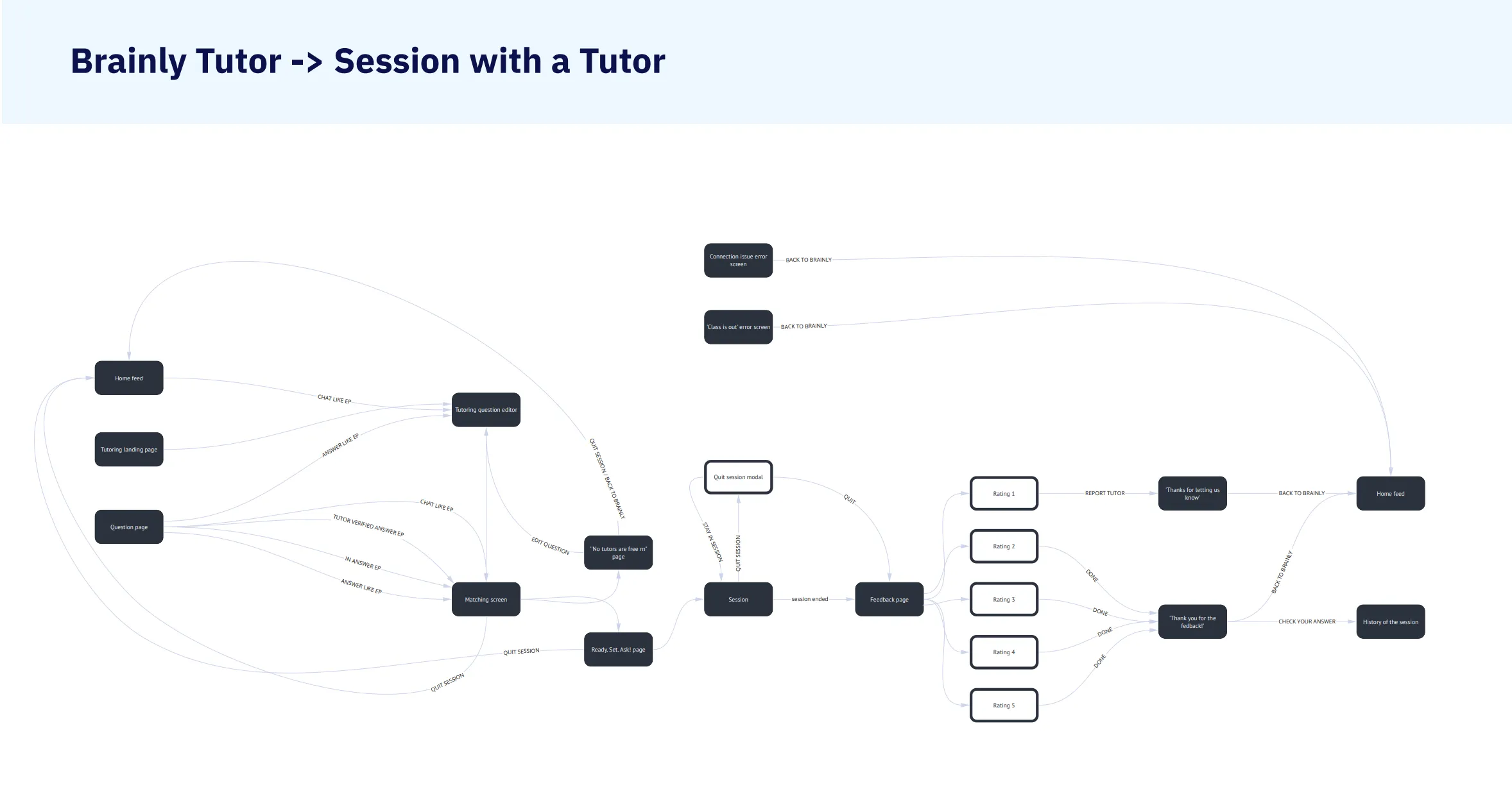
Deepening knowledge with user research
To understand the problem properly, we ran usability tests with US Brainly users who knew the brand but hadn’t used Tutoring yet – Brainly skews young, with the largest share of users between 13 and 16, so that’s who we wanted to hear from. Recruiting through an email screener (with parental consent built in alongside our legal team) drew very little response, so we kept going with snowball sampling and a $50 Amazon voucher as an incentive. Testing ran over UserTesting and Google Meet, with notes in Google Sheets and analysis in Miro.
What came back went further than the analytics alone: a significant number of participants dropped off right at the paywall screen in the prototype and didn’t even register that a trial option existed; even once aware of the trial, some hesitated because it asked for a parent’s card details up front; and people struggled to identify what Tutoring actually offered, because the value proposition itself wasn’t clearly presented.
Why didn’t I get the subscription? I don’t know if I just I’m like a penny pincher, but I don’t know if I want to spend money on this… Because I just don’t know how it’s going to be, while I pay for it. If you haven’t seen what you’re going to get for this subscription, why pay for it?
– a study participant, age 16
Two more mismatches came up repeatedly: participants expected to reach a tutor over audio or video and were surprised to find only a chat-based communicator, and they expected to ask about multiple questions or topics rather than being limited to one at a time.
Decision
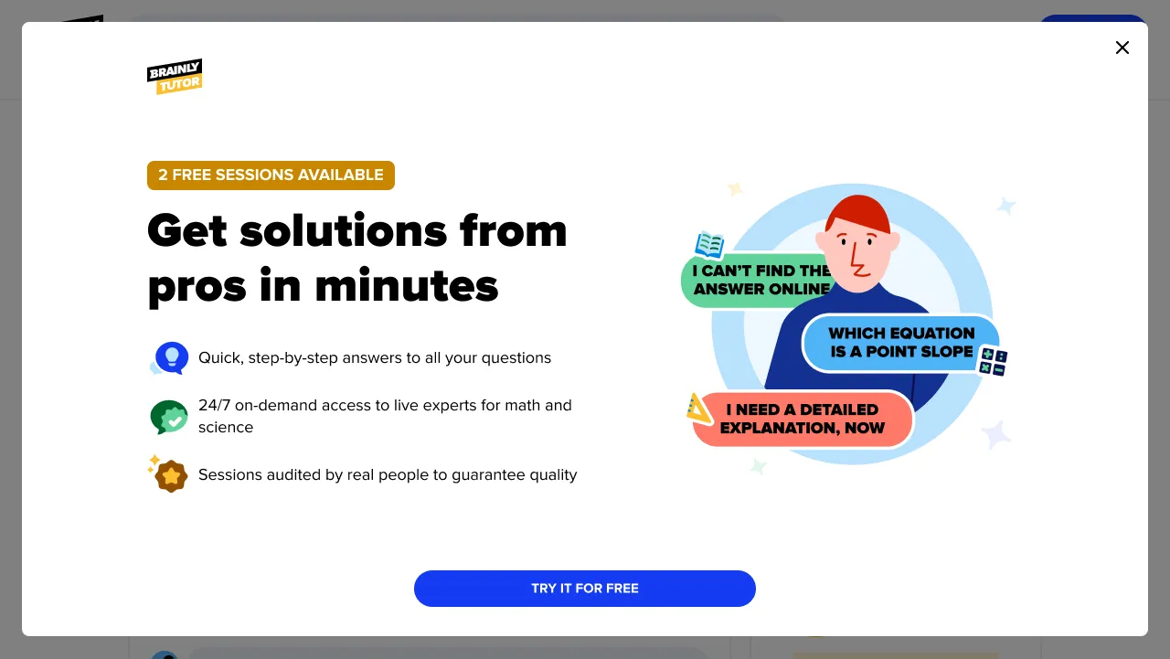
We decided to redesign the user flow to better meet what we’d heard, and to properly present Tutoring’s value proposition. We focused on users without a subscription – more than 85% of Brainly’s traffic – and wanted to let them try Tutoring without entering card details at all, and show them what we offer before asking for anything.
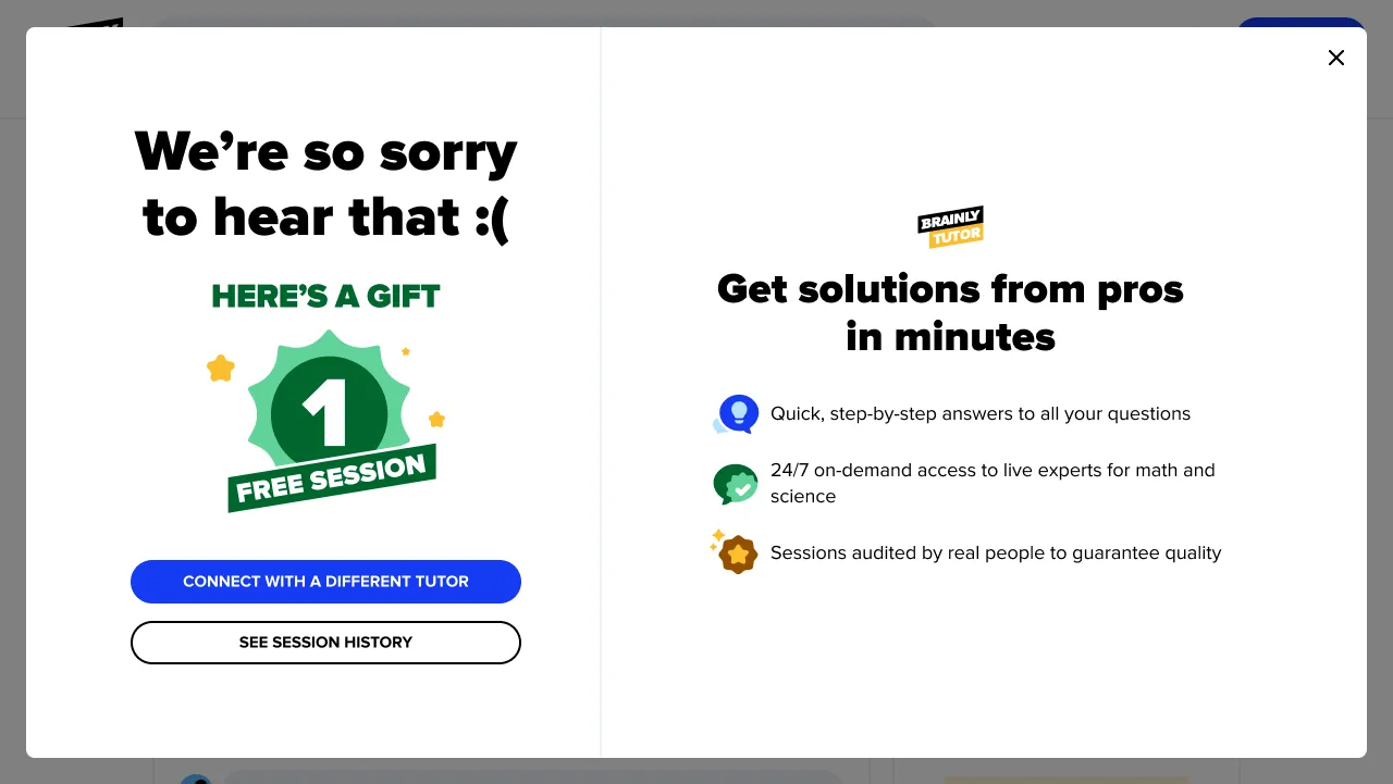
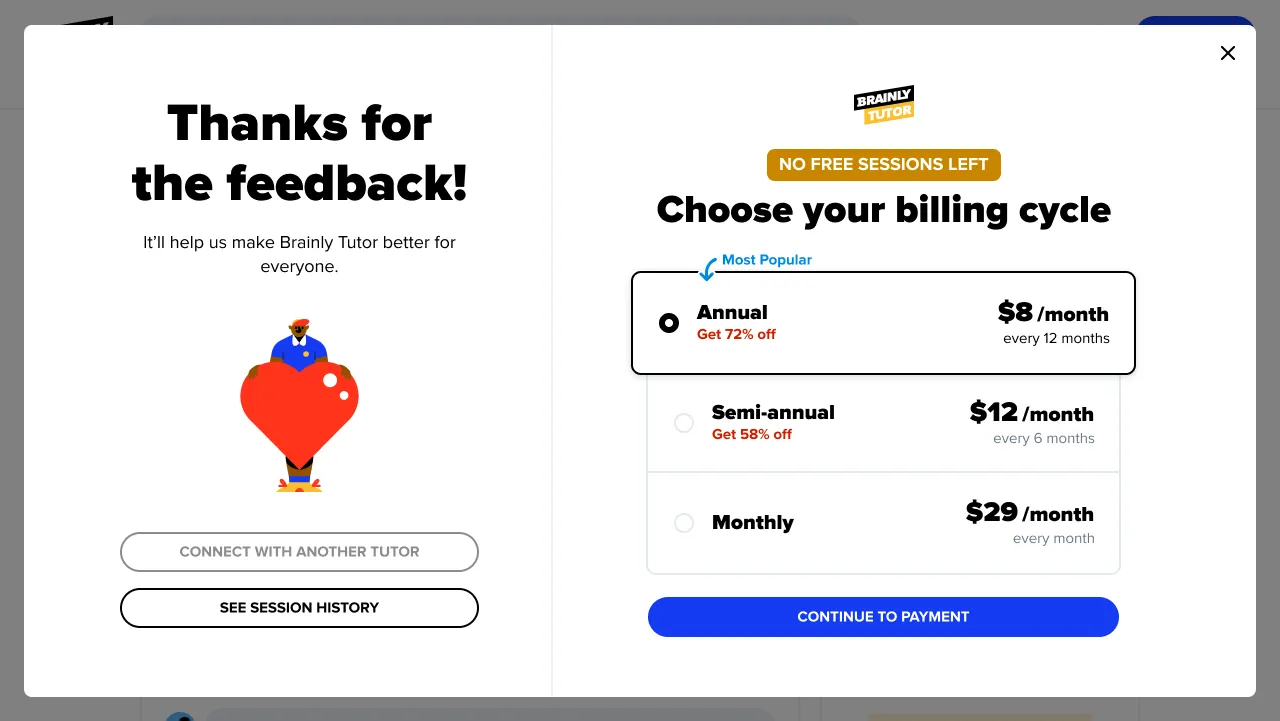
Three assumptions shaped the direction: let users test Tutoring without having to enter their card details; if someone rates a trial session negatively, give them another one as compensation, since the data showed that raised the chance of conversion; and present the product’s value clearly and straightforwardly, communicating how tutoring actually works.
Ideation
Brainstorming sessions
My team and I ran an ideation workshop targeted at the problems the research had surfaced. Ideas flowed freely, building on each other – one was an interactive landing page that dynamically showcased the product’s value; another proposed storytelling animations to make onboarding more engaging.
Storyboarding
From there we moved to storyboarding, sketching out how a user might move from discovering the product to completing a tutoring session. One storyboard depicted a user greeted with a captivating animation explaining the product’s value, followed by a guided tour of a free session.
Solution
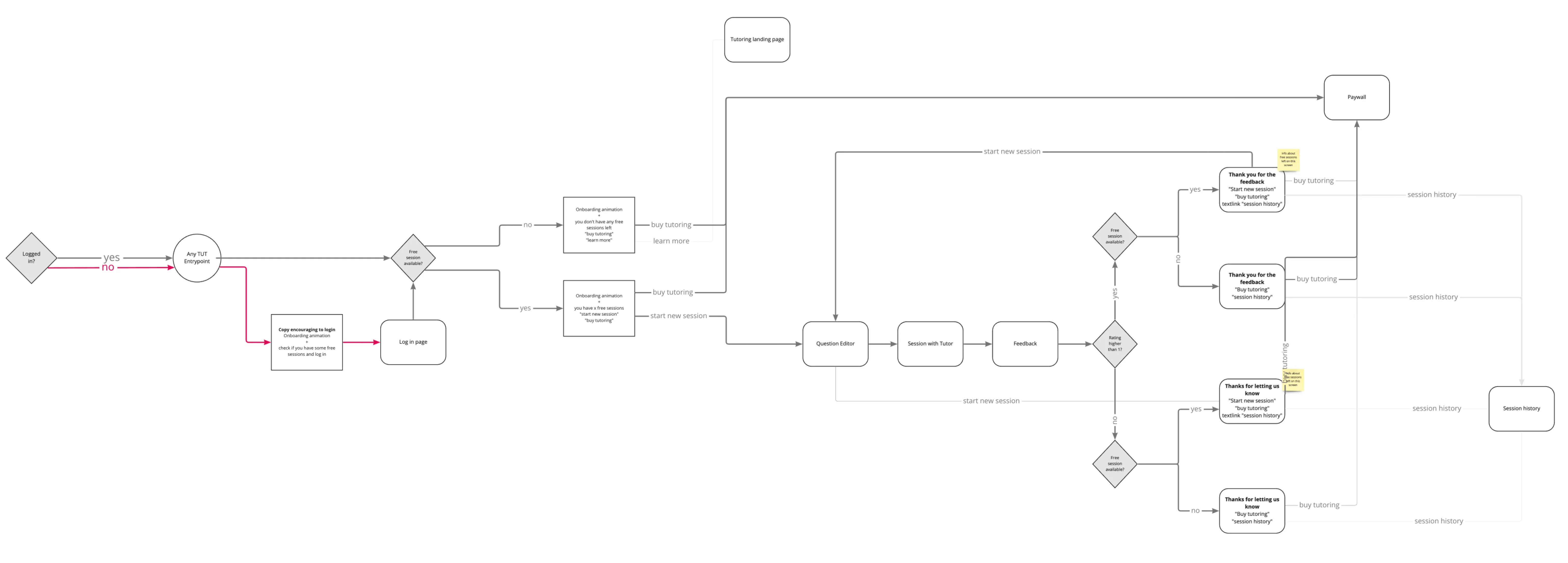
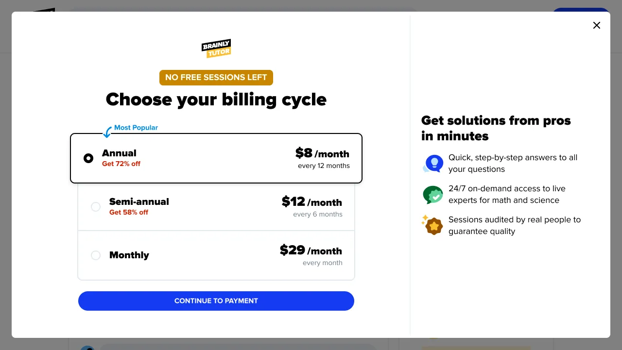
After a user clicks the Tutoring entry point, we decided to guide them step by step through using a session or purchasing a subscription; replace the time-limited trial with a package of free sessions, sized by what the experiment told us; show the user the product’s value and tell them how many free sessions they had available; support them in understanding what tutoring actually is, with an animation designed alongside our motion designer; and properly close the loop on how a session went – thanking a user for a well-rated session, or making it right with a compensation session after a poorly-rated one.
Creation of interfaces, flow and animations
Flow
Beyond individual screens, we mapped the whole user journey and experimented with different flow structures – testing sequences and interactions to find the most intuitive, engaging path.
Animation
Crafting the onboarding animation was a close collaboration with our motion designer: we co-created storyboards that captured the essence of our vision.
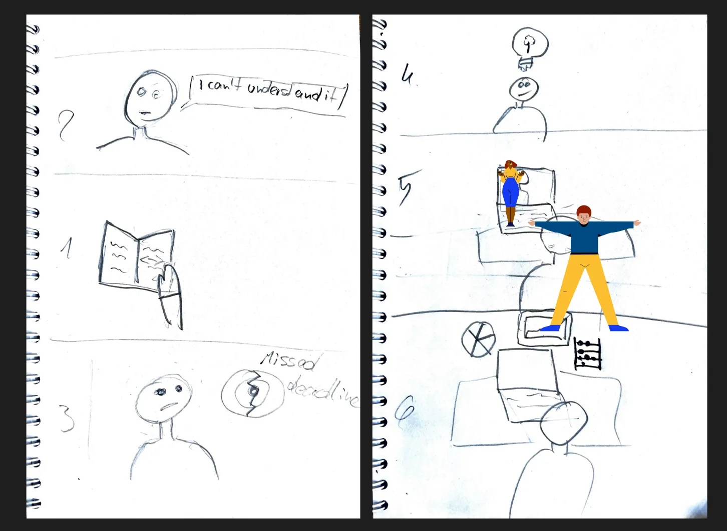
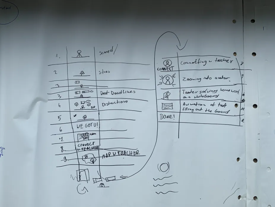
The storyboards served as a blueprint that guided the motion designer in crafting the final, polished animation, and the result was a blend of our ideation and their expertise, both informative and captivating.
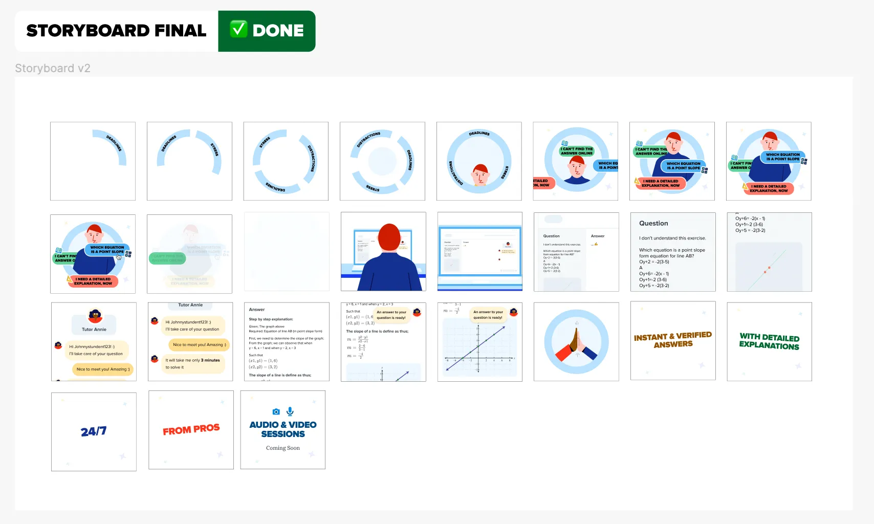
The final onboarding animation:
We made a conscious decision to represent diversity through the characters: the teacher and the student in the animation have a variety of skin tones, reflecting the diverse community Brainly serves.
Interface
For every touchpoint, we sketched and prototyped multiple iterations of the screens, to explore the full range of visual and functional possibilities before settling on a direction. Every screen went through three rounds of feedback at “Sharpener” – Brainly’s weekly review where at least one designer from every team, plus the whole Design System team, checked new work against the system – before sign-off, and every line of interface copy was written to UX-writing and plain-language principles, checked by a UX Writer on the team.
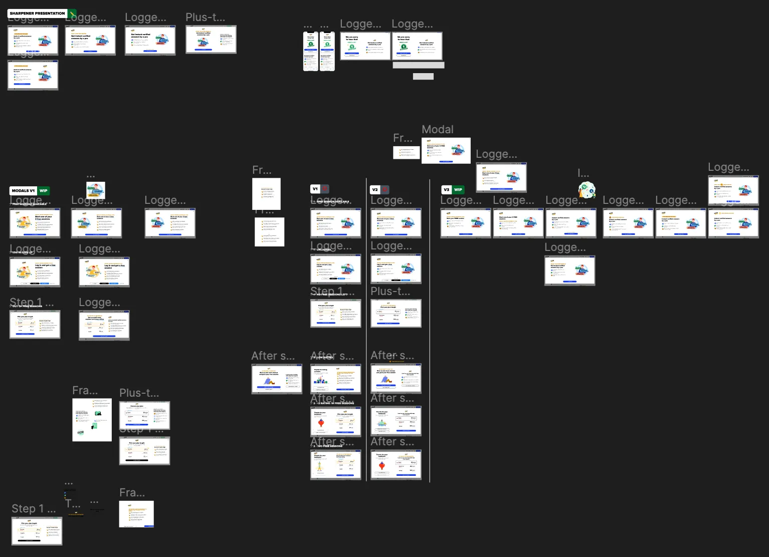
The final designs were grounded in clarity and transparency, communicating the essence of Tutoring and the chances users have to test the service. These are the key states on the web:
Experiment testing
We ran a controlled experiment to see whether creating more room for communication and generating an “aha” moment before the paywall would lift conversion, improve retention, and hold LTV:CAC (lifetime value to customer acquisition cost) above 1. We tested four scenarios: A, the original flow, as a control; B, the new flow but with no free sessions, going straight from onboarding to the existing paywall; C, the new flow with one free session; and D, the new flow with two free sessions.
Success criteria
The experiment would count as a success if there was a significant improvement in paywall conversion rate, new-subscription revenue rose meaningfully, and LTV:CAC for new subscriptions stayed above 1 – with new-subscriber activity as a secondary signal if those primary metrics came back ambiguous.
Next steps
Had the experiment not already pointed to a clear winner, the plan was to roll the new flow out across the platform, adapt it for iOS and Android, run full usability testing on the mobile versions, and keep iterating against user needs and business goals. Alongside that, we planned to document everything in Confluence as a resource for the wider organisation, and kept interested stakeholders updated with ongoing progress meetings.
The same flow on mobile:
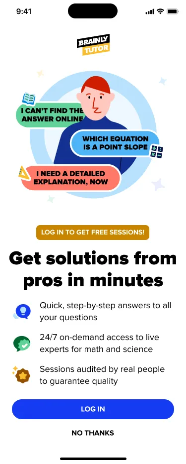
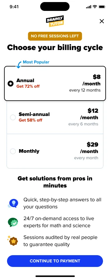
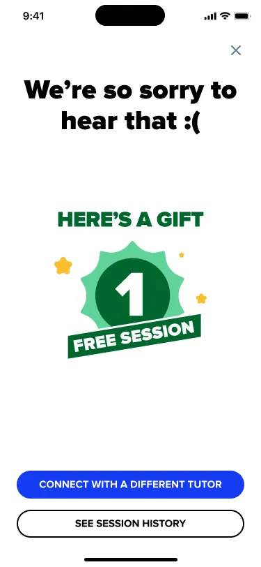
Summary
Product Successes
The experiment with the new flow and trial system proved a success. After testing and analysis, we implemented Version C across the platform – one free session in place of the old time-limited trial, plus a second free session if a user rated their first poorly. Version C was the most cost-effective option once the cost of the free sessions was weighed against the outcomes: it struck the right balance between acquisition cost and the lifetime value of new subscriptions, improving conversion while also raising how people felt about their first experience with the product.
What I’ve learned
This project drove home how much alignment between teams matters for work at this scale – synchronising goals, timelines and communication across design, product, engineering and analytics was the real cornerstone of getting it shipped. It also taught me the value of staying adaptable: our original recruiting plan didn’t survive contact with reality, and working around that reinforced that setbacks are something to problem-solve past, not a reason to stall.